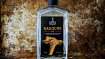
Labels for drink products certainly aren't what they used to be...and that's a wonderful thing!
Anyone who lives in B.C. will tell you that our province has an amazing liquor industry. It's one that is best known for its wines, of course, but the province also produces everything from award-winning wines to ciders, beers, spirits and more.
Better yet, there are many that go above and beyond when it comes to the design of their bottles and cans. These producers look to talented–and often burgeoning–visual artists of all styles to help catch a buyer's eye on what can often be a crowded shelf at liquor stores. The benefit of a drinks maker with a local artist is two fold: it helps to stimulate the creative industry and it also helps their drinks stand out from the pack.
I recently chatted with five different liquor producers in interior B.C. who embrace art collaboration on why art is a key component of what they do.
Counterflow Brewing (Penticton)
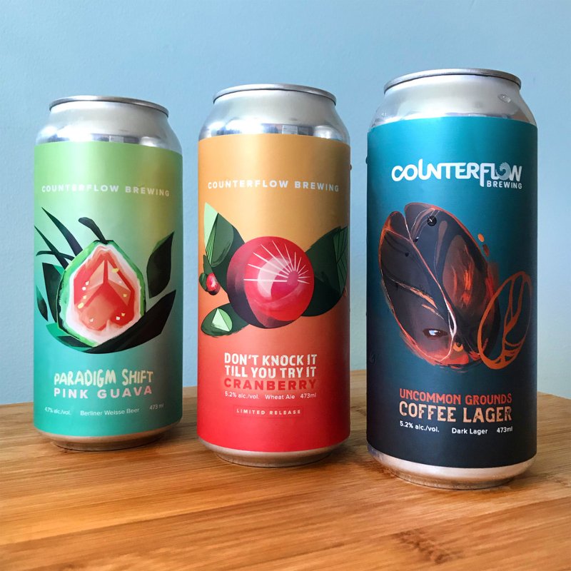
Counterflow Brewing is one of the Okanagan’s newest–and extremely micro-craft–breweries. Born out of winning a home brewing competition, co-owners Taylor Ballantyne, Malcolm Potts, Jason Lanki and Kyle Finnerty eventually found themselves brewing sours and fruit beers out of Penticton’s Bad Tattoo Brewing with Lee Agur (LA).
Who’s your artist, and why did you want to work with them?
LA: We wanted to collaborate with Liz Ranney because of her use of bright and bold colours. It [the artwork] really stands out and grabs your eye, especially when you are in a sea of one-thousand different beer cans. Collaborating with a local artist who also gets to see their work on shelves around town feels great, and we are so glad we chose a local designer.
From your portfolio, which label artwork is your favourite?
LA: Our favourite is the Paradigm Shift Pink Guava; it was our first child. No matter what anyone says, the first child is very special for a lot of reasons. Liz far exceeded our expectations on what we were looking for–she translated our gibberish into the beautiful stand-out label that people gravitate towards.
What came first, the artwork or the beer?
LA: Well, in this instance, the beer. We tried forty different beers before we landed on our first one. Many times, we think we have an awesome name or an idea that would create a very cool label, but the beer doesn't match up or doesn’t meet our expectations, so we have to go back to the drawing board.
Creek & Gully Cider (Penticton)
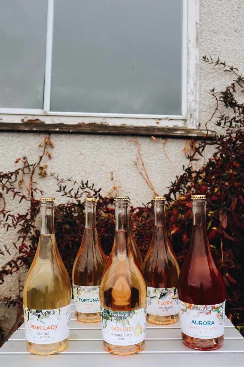
Nestled amongst Naramata’s winding roads, Creek & Gully Cider is all about organic farming. When farming roots go five generations deep, it’s safe to say supporting local is not just what they do, it is who they are.
For Annelise Simonsen and Kaleigh Jorgenson (KJ), the process begins with paying tribute to organic apples–different sizes, shapes and blemished personalities–pressed and fermented using pétillant naturel and traditional methods that are akin to making sparkling wine.
Who’s your artist, and why did you want to work with them?
KJ: Jamie Evrard is a long-time family friend and has been instrumental to realizing our dream. Her artwork is so natural and vibrant we wanted to incorporate its vivacious energy. We love Jamie’s artwork and she offered many of her existing paintings to work with — they’re often extravagantly large in real life, so to have a version adorning our bottles is a beautiful way for people to see them.
From your current portfolio, which product have your favourite label artwork?
KJ: Our new cans are stunning. We have a core colour palette that we work with, then mesh and adapt the [various] label-looks with fragments of Jamie’s paintings.
What came first, the artwork or the cider?
KJ: Cider comes first, then we brainstorm a name and find the artwork to match. The ciders all have such different personalities — it’s so fun to get to know them. The label is like a fabulous accessory.
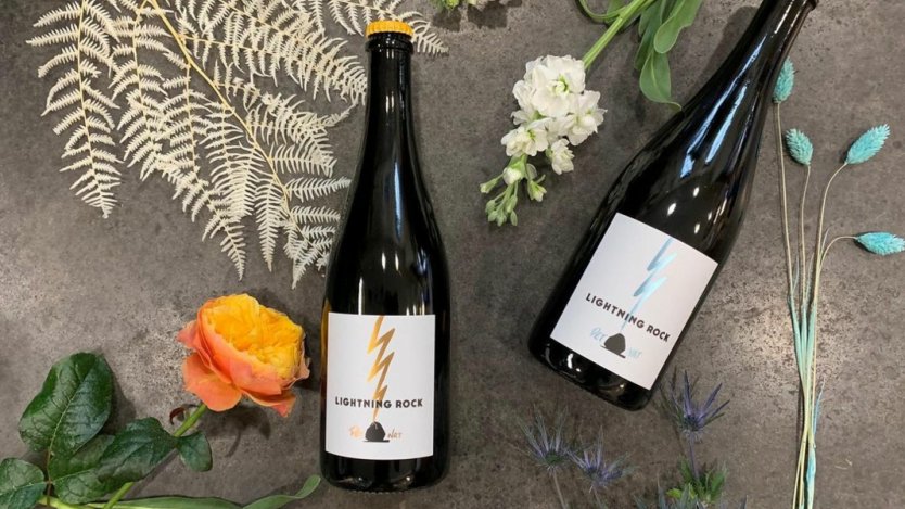
Lightning Rock Winery (Summerland)
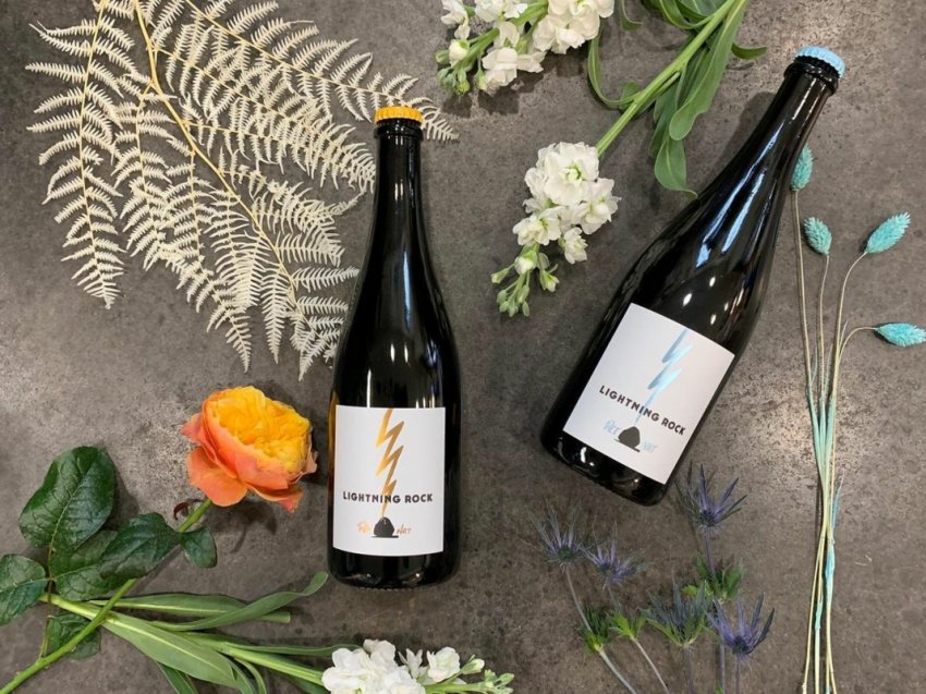
Located in Summerland, Lightning Rock is a small-lot winery banging out electric–predominantly single vineyard and single varietal–natural sparkling and still wines. Focusing on pinot noir, chardonnay, viognier and syrah, the farmer-winemaker duo Jordan Kubek (JK) and Tyler Knight are known for sabering bottles of bubbles with everything from a ski to an iron.
Who’s your artist, and why did you want to work with them?
JK: Sam Smith is the best! She’s a friend of Tyler's from high school–she’s local and super talented. We try as much as possible to support local people in everything we do.
What came first, the artwork or the wine?
JK: The wine came first. However, both Tyler and I are farmers and not overly artistic. Working with someone like Sam, who knew Tyler and the Okanagan, made coming up with a design we love harmonious.
Out of all of your current vintages, which bottle boasts your favourite artwork?
JK: I love the Pét-Nat labels with the lightning bolt and the rock. It is really dynamic; I think it captures the essence of the wine and what we are all about.
Rigour & Whimsy (Okanagan Falls)
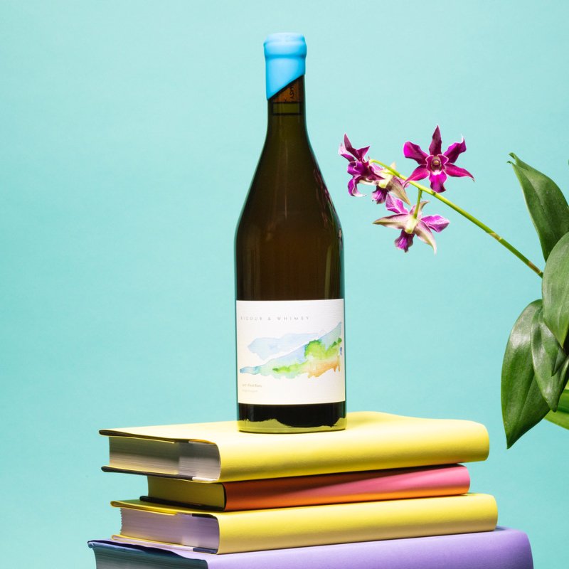
Wife-husband team Jody and Costas Gavaris know a thing about seeking balance–in themselves, their relationships and the natural world. So, think of Rigour & Whimsy as the ying and the yang to find a little harmony in their orange (or amber), gamay and syrah wines, to name a few.
Who are your regularly contributing artists, and why did you want to work with them?
JG: Art means everything to us! We like to work with artists whose work resonates with us; and who we feel can use their artistic vision and voice to more skillfully capture and communicate the essence of each of our wines and their stories. We work with different artists on each of our wine labels. Most recently, we have worked with Annie Robinson, Sarah Gee Miller, Nicole Young. And this year, we will be working with Alexandra Goodall and Aaron Metz.
You've worked with many different artists. Do you have a favourite label?
JG: Oh geez, that is a tough question. We have new favourites every year–I would probably have to go with the watercolour painted by Annie Robinson that adorns our first two vintages of wines (2016 and 2017 Pinot Blanc). Annie and I were colleagues in our past urban jobs and lived in Vancouver. To me, this painting represents hope, vision, alignment, integrity, transformation and peace–all the attributes that kept us going while we were in the midst of a major life transition, and kept our eyes on the horizon that we were dreaming up and living into.
What came first, the artwork or the type of wine?
JG: Definitely the type of wine. We started this crazy business because Costa is OBSESSED with wine. So in our approach, we like to let the wines–and his artistic vision in creating them–lead the rest of our creative process. The vintage (weather, challenges, opportunities), the winemaking approaches, and everything that the wine becomes to us in terms of what it means and represents.
Do you incorporate commissioned art in any other ways through your business?
JG: Yes! We also incorporate commissioned art into the postcards we include on our hand-signed thank you cards that accompany each of our online order shipments.
Ursa Major Winery (Oliver)
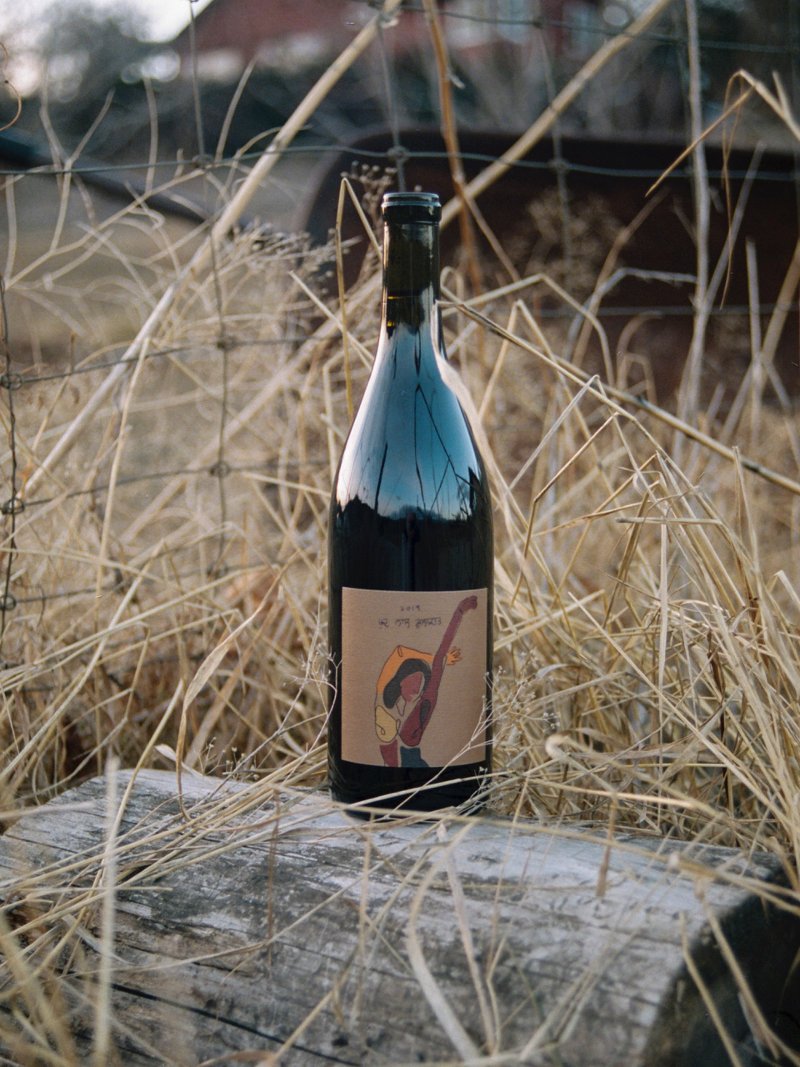
Rajen Toor (RT) was born and raised on his family’s vineyard on the Black Sage Bench in Oliver. After years of conventional wine growing, he’s taken on the task of rebuilding his family farm’s soils and biodiversity using regenerative farming practices. Toor has switched to organic grape growing and sustainable cellar practices and as such, he now shines bright with Ursa Major.
Who’s your artist, and why did you want to work with them?
RT: Every year, I try to do a one-off art label for a certain wine [like our 2019 "Meeting of Self" Cabernet Franc]. The artist I worked with this year is Anoushka Mirchandani from San Francisco. I found her work through social media; all of her pieces resonated with me. Her recent series was based on a shared first-generation experience; of breaking cycles, mental and emotional freedom and all of the nuances that come along with it. This is the exact story I was trying to tell through the wine–it was very important to work with an Indian artist because there was a specific first-generation born in North America story [that] I was trying to tell with this wine.
How do you incorporate art in other ways?
RT: I've always been a fan of poetry, so it was a no-brainer to use a very personal style of poetry to tell the stories I wanted to tell. Just a couple of lines to sum it all up. To sum up exactly the personal context and where my head is at, at the time.
What came first, the artwork or the wine?
RT: The wine always comes first; everything is tailored around the wine itself.
 have long been selling alcohol.")
")